


用CSS画一个小米的新logo
前情提示
小米今天换新logo了,据说花了200万。

雷布斯总能在宣传上给我们整点新花样。

网上更是炸翻了天,说一行代码,就值200万?
要不是说雷布斯是个懂营销的程序员呢,普普通通换个logo,小米立马上热搜。一想到小米汽车也要上线了,不得不服雷布斯这波还是有点东西的。
事情真的那么简单?
外行看热闹,内行看门道。
这次的设计师**原研哉(はら けんや)**你可能不熟悉。
但是他的设计你肯定知道。没错,他就是无印良品的艺术总监。

一个logo值200万,逼着我又去仔细研究了一下。果不其然,发现了端倪。
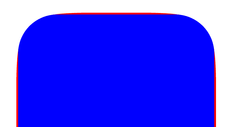
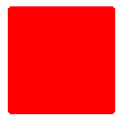
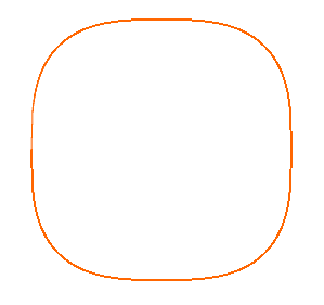
首先,这次的logo并不是一行代码那么简单的圆角处理。对比下图。

我这36K纯氪金狗眼都看出了二者的区别。简单来说,左边是圆角,右边是明显不是一般的圆角。
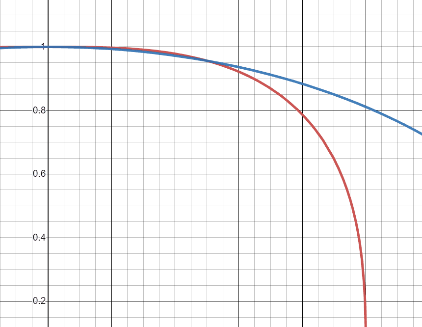
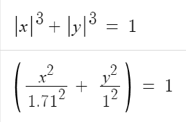
又去看了一下设计理念,这次logo用的是笛卡尔坐标系下的Lamé曲线。也被称为超椭圆。函数图像如下。
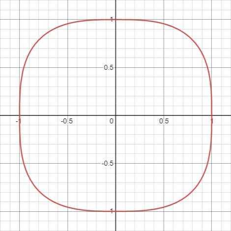
那么问题来了,既然不是一行CSS的问题,那如何用CSS画超椭圆呢?
CSS实现超椭圆
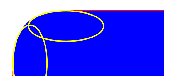
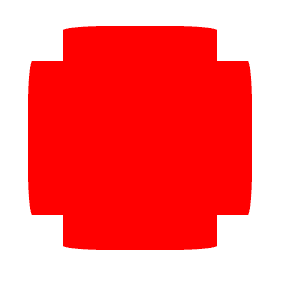
比较一下超椭圆和圆角的区别。
差异主要是处理红色部分的外凸。如果你熟悉PS,用过铅笔工具,很轻易了解这里需要调整切线的轴线长度。不了解也没关系,用大白话来说,弯角部分的弧线,不是正圆,而是椭圆。
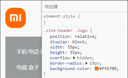
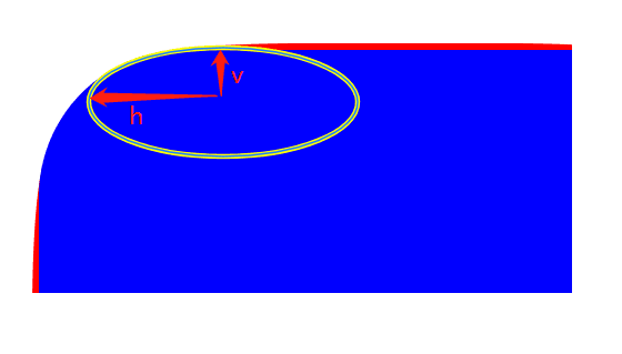
那么用border-radius怎么能实现一个轴长不等的椭圆角呢?这个时候我们回归文档看一下。
MDN关于border-raiuds有这么一小行字 followed optionally by "/" and one, two, three, or four
也就是说,在/前面的数值,是h轴的长度,后面的数值是v轴的长度。
来实现一下这种圆角。
.super-ellipse {
  border-radius: 30% / 2%;
  height: 220px;
  position: relative;
  width: 220px;
}
仿佛是这种套路。但很明显,这种方法只定义了h和v的比,导致只有矩形的上下两边外凸。因此我们还需要在左右两边实现同样的效果。最简单的方式是使用伪元素。
.super-ellipse {
  height: 220px;
  position: relative;
  width: 220px;
}

.super-ellipse::after,
.superellipse::before {
  background-color: red;
  content: "";
  position: absolute;
  z-index: -1;
}

.super-ellipse::before {
  border-radius: 2% / 30%;
  bottom: 0;
  left: 0;
  right: 0;
  top: 0;
}

.super-ellipse::after {
  border-radius: 30% / 2%;
  left: 0;
  right: 0;
  top: 0;
  bottom: 0;
}
但是这样有个问题,外凸的弧线被另一个方向的元素遮挡了。我们调整一下伪元素宽高。
.super-ellipse {
  height: 220px;
  position: relative;
  width: 220px;
}

.super-ellipse::after,
.superellipse::before {
  background-color: red;
  content: "";
  position: absolute;
  z-index: -1;
}

.super-ellipse::before {
  border-radius: 2% / 30%;
  bottom: 33px;
  left: 0;
  right: 0;
  top: 33px;
}

.super-ellipse::after {
  border-radius: 30% / 2%;
  bottom: 0;
  left: 33px;
  right: 33px;
  top: 0;
}
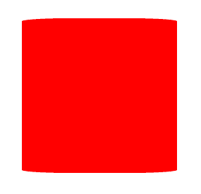
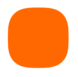
虽然像红十字会的标志,但其实很接近了。我们最后给父元素一个border-radius并上色看看,再微调一下伪元素的位置。哦,别忘了小米的配色。
.super-ellipse {
  background-color: #ff6700;
  border-radius: 20%;
  height: 220px;
  position: relative;
  width: 220px;
}

.super-ellipse::after,
.superellipse::before {
  background-color: #ff6700;
  content: "";
  position: absolute;
  z-index: -1;
}

.super-ellipse::before {
  border-radius: 2% / 30%;
  bottom: 33px;
  left: -2px;
  right: -2px;
  top: 33px;
}

.super-ellipse::after {
  border-radius: 30% / 2%;
  bottom: -2px;
  left: 33px;
  right: 33px;
  top: -2px;
}
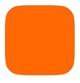
除了没有MI的字外,很相近了。
真的一致了吗?
我相信有些产品秉着“必须与设计稿重合”的原则来衡量上面的成品图,我不得不承认刚刚做出来的效果很相近,但是没到完全一致的程度。
原因在于,椭圆函数曲线与非二次幂的Lamé曲线在图像上根本不可能重合,因此无论你怎么调整border-radius都不可能实现非二次幂的Lamé曲线。
那么有没有方法能通过画一条函数曲线,来实现矩形的边角呢?
直觉告诉我应该用canvas。可以利用微积分的思想,将所有图像上的点绘制出来并连接。
第一版本我尝试了完全使用直线依次连接所有的点,发现虽然绘制出来了,但是无法填充,且锯齿明显。
const canvas = document.getElementById('canvas');
const ctx = canvas.getContext('2d');
const width = 240;
const height = 240;
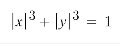
const calcY = x => ((width / 2)**3 - x**3)**(1 / 3)
ctx.setTransform(1, 0, 0, 1, width / 2 + 8, height / 2 + 8);
ctx.strokeStyle = '#ff6700';
ctx.moveTo(-width / 2, 0);
for (let i = -width / 2; i <= width / 2; i++) {
const j = calcY(Math.abs(i));
ctx.lineTo(i, j);
ctx.stroke();
}
for (let i = width / 2; i >= -width / 2; i--) {
const j = -calcY(Math.abs(i));
ctx.lineTo(i, j);
ctx.stroke();
}
行,不就是丝滑么,惊得我吃了两块某芙巧克力,用贝塞尔曲线试试。果不其然,大功告成。
const canvas = document.getElementById('canvas');
const ctx = canvas.getContext('2d');

const width = 240;
const height = 240;
const calcY = x => ((width / 2)**3 - x**3)**(1 / 3)

ctx.setTransform(1, 0, 0, 1, width / 2 + 8, height / 2 + 8);
ctx.beginPath()
ctx.moveTo(width / 2 + 8, 0);

for (let i = -width / 2; i <= width / 2; i++) {
  const j = calcY(Math.abs(i));
  ctx.bezierCurveTo(i, j, i, j, i, j);
}

for (let i = width / 2; i >= -width / 2; i--) {
  const j = -calcY(Math.abs(i));
  ctx.bezierCurveTo(i, j, i, j, i, j);
}

ctx.closePath();
ctx.fillStyle = '#ff6700';
ctx.fill();
进阶思考
这时候突然闯进一只杠精嚷道:canvas者不为CSS也。
行,你神头鬼脸。

canvas是HTML元素,的确。那到底有没有一种CSS方法能够让我们去像canvas这样自定义地绘制路径呢?
经过一系列研(tou)究(kui),还别说,在2016年前后诞生的CSS Houdini真可以实现这个需求。
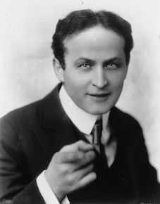
CSS Houdini你可以大致理解为,CSS开放API给开发人员,开发人员通过API自行扩展CSS。这个名字在很多领域都能看得到,基本都和一些视觉效果相关。实际上都是为了纪念Harry Houdini,史上最伟大的魔术师。
CSS Houdini主要提供了6组API,其中Paint API可以满足需求。我们可以使用Paint API自定义background的属性值,进而实现超椭圆的效果。步骤如下:
- 声明一个
paint.js开发绘制方法
registerPaint是内置方法,第一个参数表示需要注册的Houdini的名称,这里我们就叫suerEllipse。第二参数需要传入一个类,且包含paint方法。其内容和canvas的实现基本一致。
registerPaint(
  "superEllipse",
  class {
    paint(ctx) {
      const width = 256;
      const height = 256;
      const calcY = (x) => ((width / 2) ** 3 - x ** 3) ** (1 / 3);

      ctx.setTransform(1, 0, 0, 1, width / 2, height / 2);
      ctx.beginPath();

      for (let i = -width / 2; i <= width / 2; i++) {
        const j = calcY(Math.abs(i));
        ctx.bezierCurveTo(i, j, i, j, i, j);
      }

      for (let i = width / 2; i >= -width / 2; i--) {
        const j = -calcY(Math.abs(i));
        ctx.bezierCurveTo(i, j, i, j, i, j);
      }

      ctx.closePath();
      ctx.fillStyle = "#ff6700";
      ctx.fill();
    }
  }
);
- 通过
paintWorklet注册paint.js中的方法。
<script>
  CSS.paintWorklet.addModule("paint.js");
</script>
- 为某个元素的
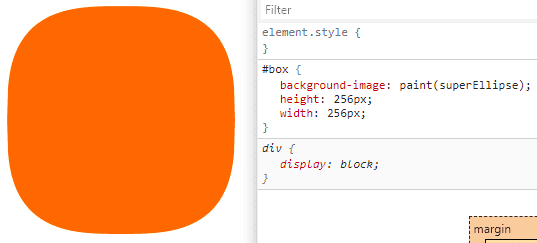
background-image添加包含paint.js提供方法的属性值实现超椭圆。
<style>
  @supports (background-image: paint(id)) {
    #box {
      background-image: paint(superEllipse);
      height: 256px;
      width: 256px;
    }
  }
</style>
成功了。你再杠一个我看看。
通配改造
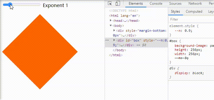
杠精捂着被打肿的脸又说:你这定了宽高,我DOM一旦不是256px你这就废了。

行,我这次非要把你整瓷实了。

registerPaint接入的class中的paint函数除了ctx之外,还有另外三个参数,形如paint(ctx, geom, props, args)。
-
ctx可以认为是canvas的绘制上下文。 -
第二个参数是包含被绘制DOM宽高的对象。
-
第三个参数是DOM可用的自定义属性的数组。
-
第四个参数是在css中调用
paint时的参数数组。(尝试之后发现Chrome 89不支持额外参数)
很明显,第二参数可以获得当前DOM的宽高,就是它了。立马来改造一下。
registerPaint(
  "superEllipse",
  class {
    // custom properties
    static get inputProperties() {
      // n - the exponent of Lame curve
      return ["--n"];
    }

    paint(ctx, geom, props) {
      const { height, width } = geom;
      const exp = props.get("--n")?.[0] || 3;

      const calcY = (x) => ((width / 2) ** exp - x ** exp) ** (1 / exp);

      ctx.setTransform(1, 0, 0, 1, width / 2, height / 2);
      ctx.beginPath();

      for (let i = -width / 2; i <= width / 2; i++) {
        const j = calcY(Math.abs(i));
        ctx.bezierCurveTo(i, j, i, j, i, j);
      }

      for (let i = width / 2; i >= -width / 2; i--) {
        const j = -calcY(Math.abs(i));
        ctx.bezierCurveTo(i, j, i, j, i, j);
      }

      ctx.closePath();
      ctx.fillStyle = "#ff6700";
      ctx.fill();
    }
  }
);
目前Houdini的支持程度相对较低,手机浏览器可能无法预览效果。
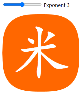
最后的最后,我们画一个小米的新logo。
雷布斯赏我辆小米汽车不为过吧?
帮我买杯咖啡吧 ☕️


